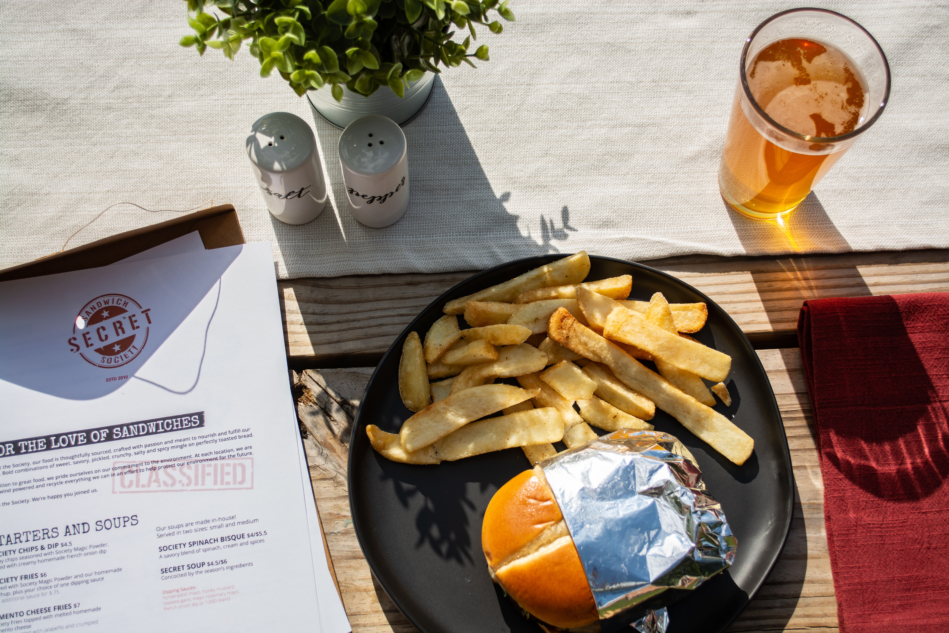
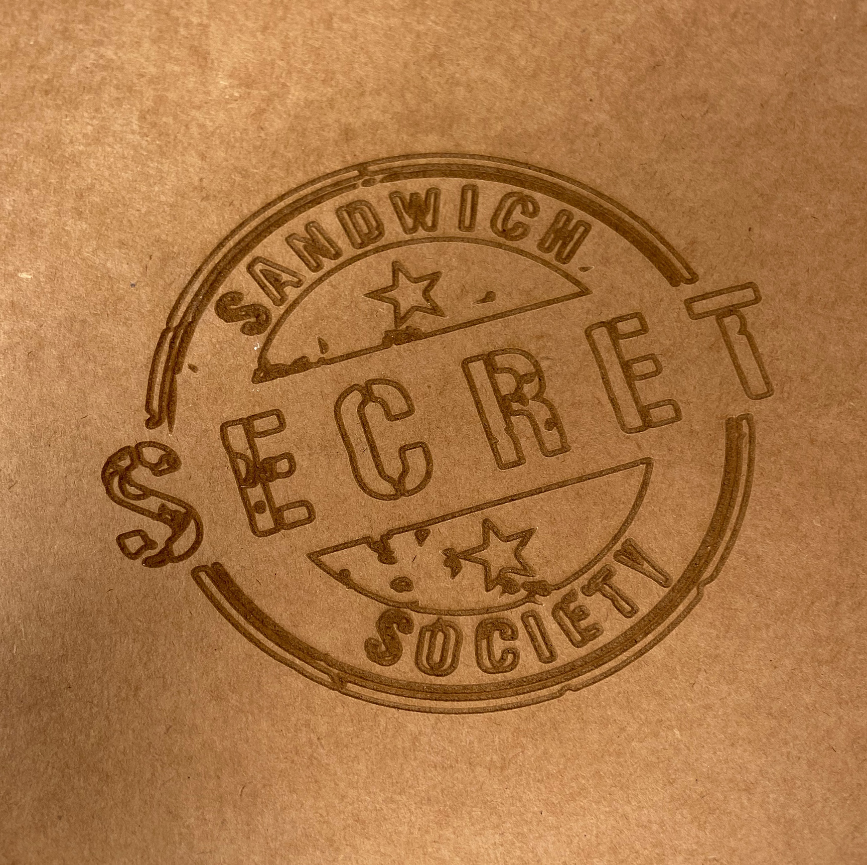
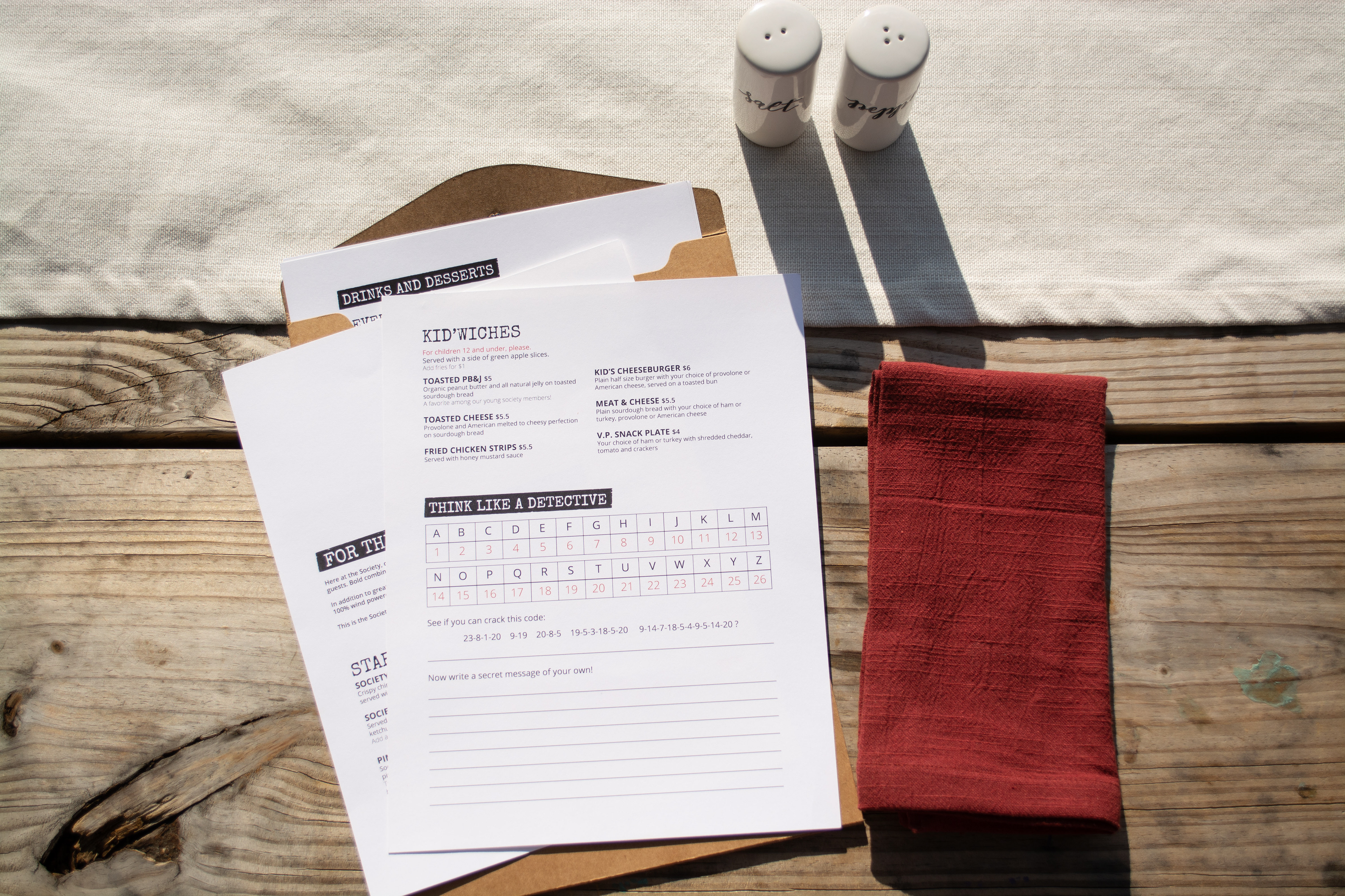
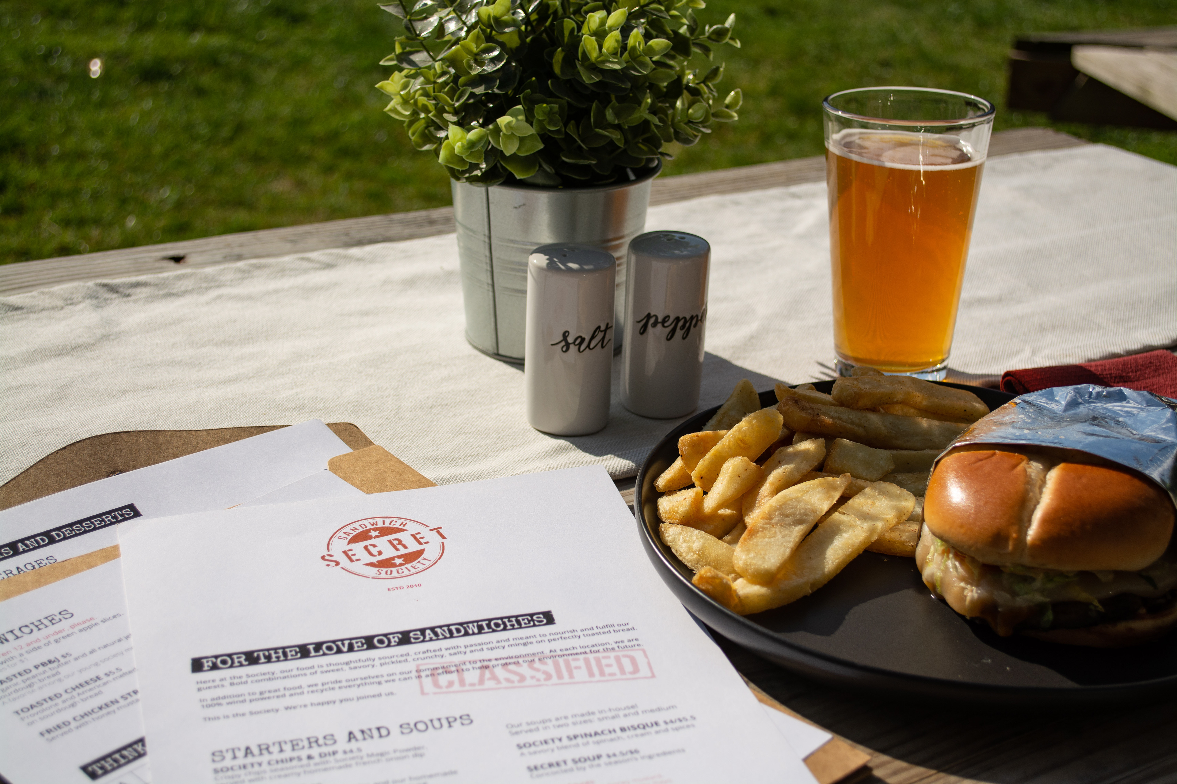
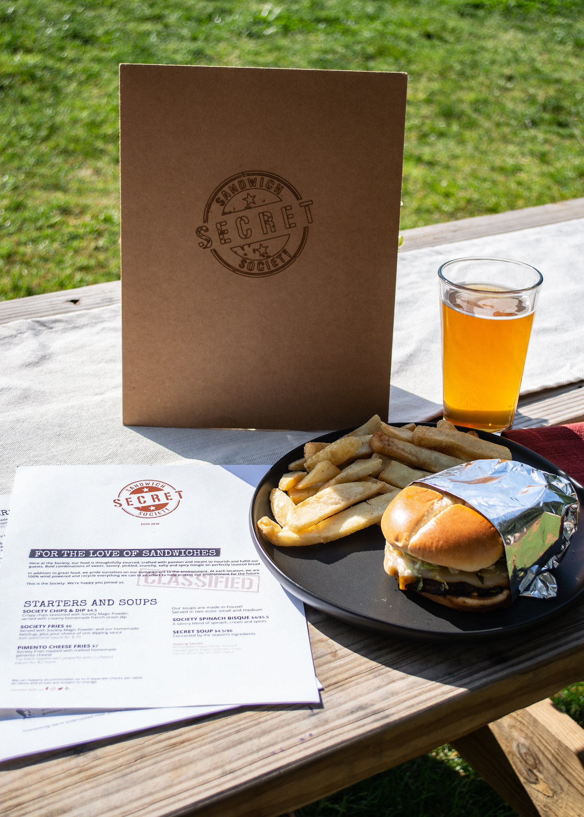
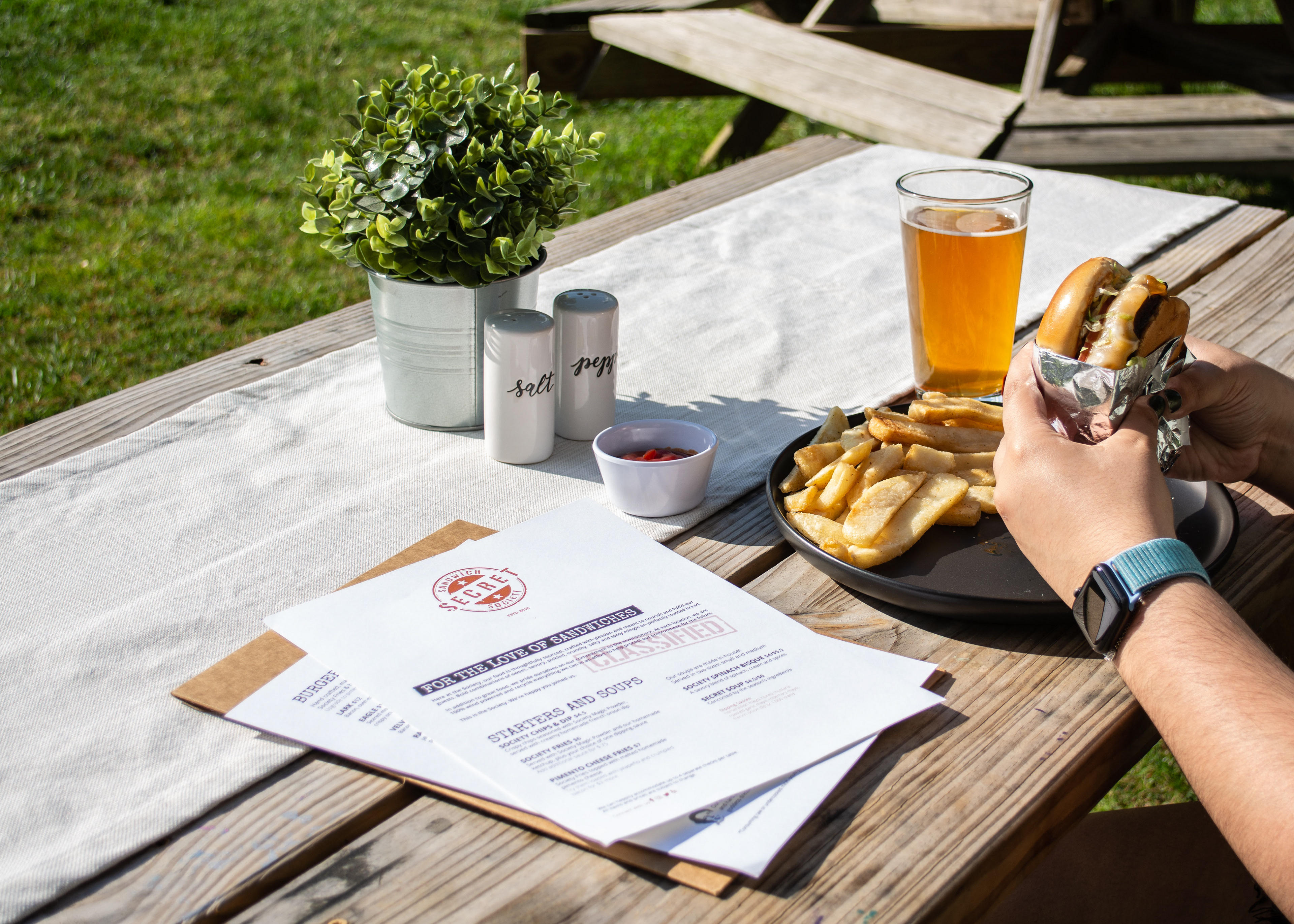
For my menu redesign project for the Secret Sandwich Society, I dove into typography pairing, layout, and print design to create a menu experience with a playful twist. It was my first time using a 3D printer, and I etched the new logo into a manila folder that holds the menus, adding a tactile element to the design. I wanted every customer to feel like a secret agent on a delicious mission to assemble their perfect meal. This project was a fun blend of creativity and hands-on experimentation with print!
________
Challenges.
1. How can I ensure that the typography choices capture the "secret agent" theme without compromising readability for a variety of customers?
2. What layout structure will effectively balance the unique sandwich options while guiding customers intuitively through the menu sections?
3. How can I incorporate interactive or tactile elements that make the menu experience memorable without overwhelming the design?
4. What strategies can I use to make the 3D-printed logo etching durable yet cost-effective, considering frequent handling by customers?
_________
Looking back.
If I could go back to this project, I would make the menu double-sided. Including the kids' menu, there are 5 pages total, and printing them double-sided would make it much easier to keep track of all the pages.
Original Secret Sandwich Society menu.
__________
Project details.
Client
Secret Sandwich Society
Year
2020
Services
Brand Enhancement
Typography & Layout
Print Design
Prototyping & Testing
Food Photography
