TransImpact is a global technology company specializing in SaaS organization that supports supply chain businesses. Their resources have saved clients over a billion dollars.
I joined the Marketing and Design teams while the company was going through an extensive rebrand and merging with Avercast, another supply chain management software company. My work with TransImpact consisted of creating print and web collateral that reinforced their modernized look.
Icon Design Style Guide I designed.
________
Challenges.
1. How do we balance innovation with brand consistency in this rebrand, ensuring all assets feel fresh yet still familiar to current clients?
2. What strategies can we use to ensure our new designs effectively communicate the rebrand across diverse collateral, from social media to print, that the sales team and clients will adopt and use with confidence?
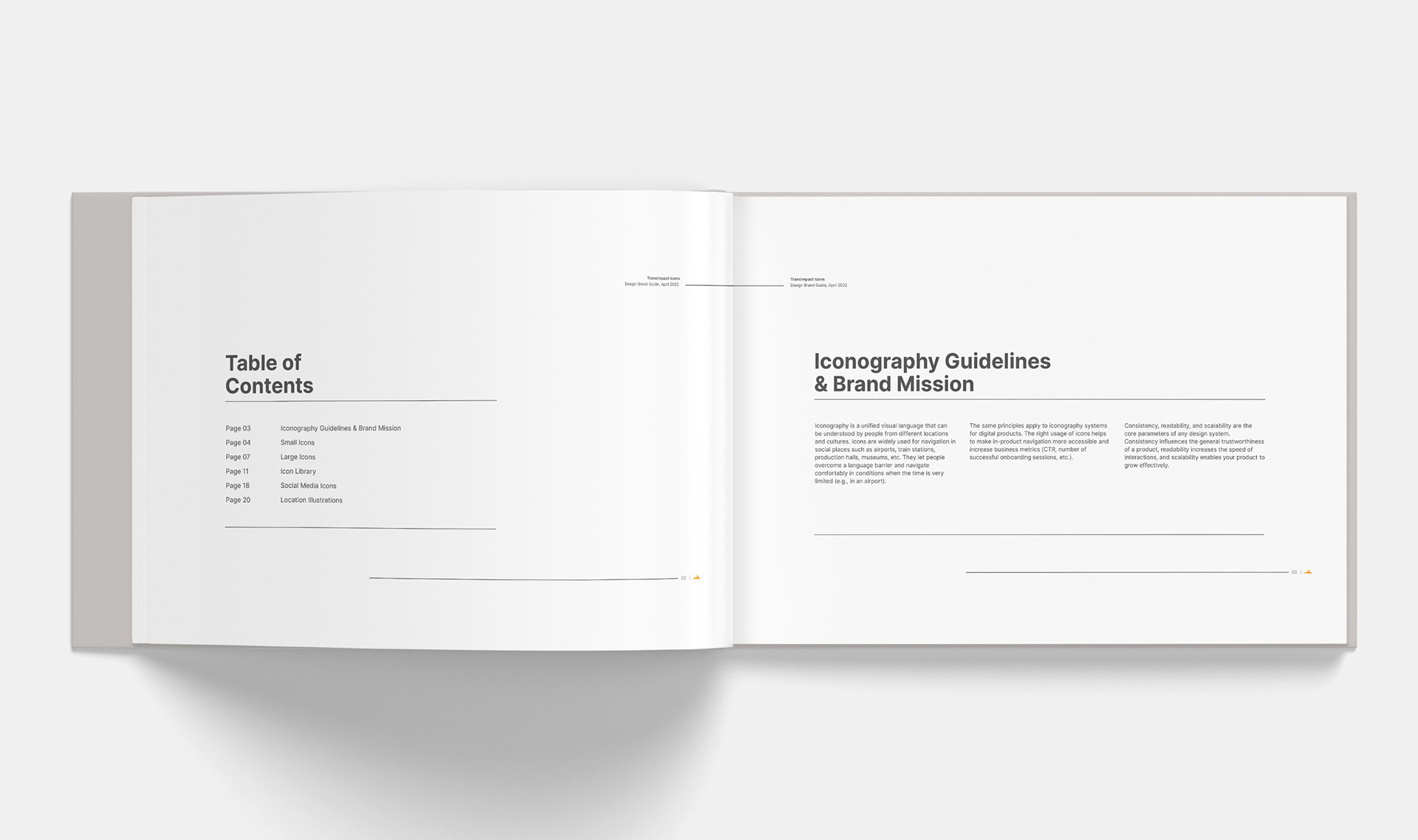
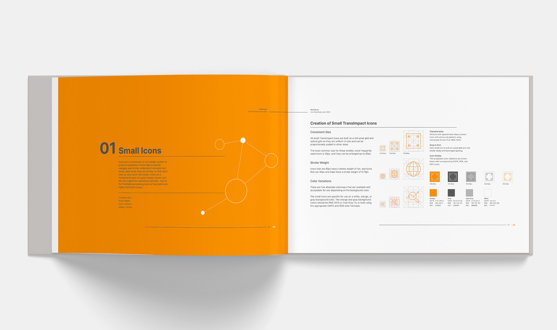
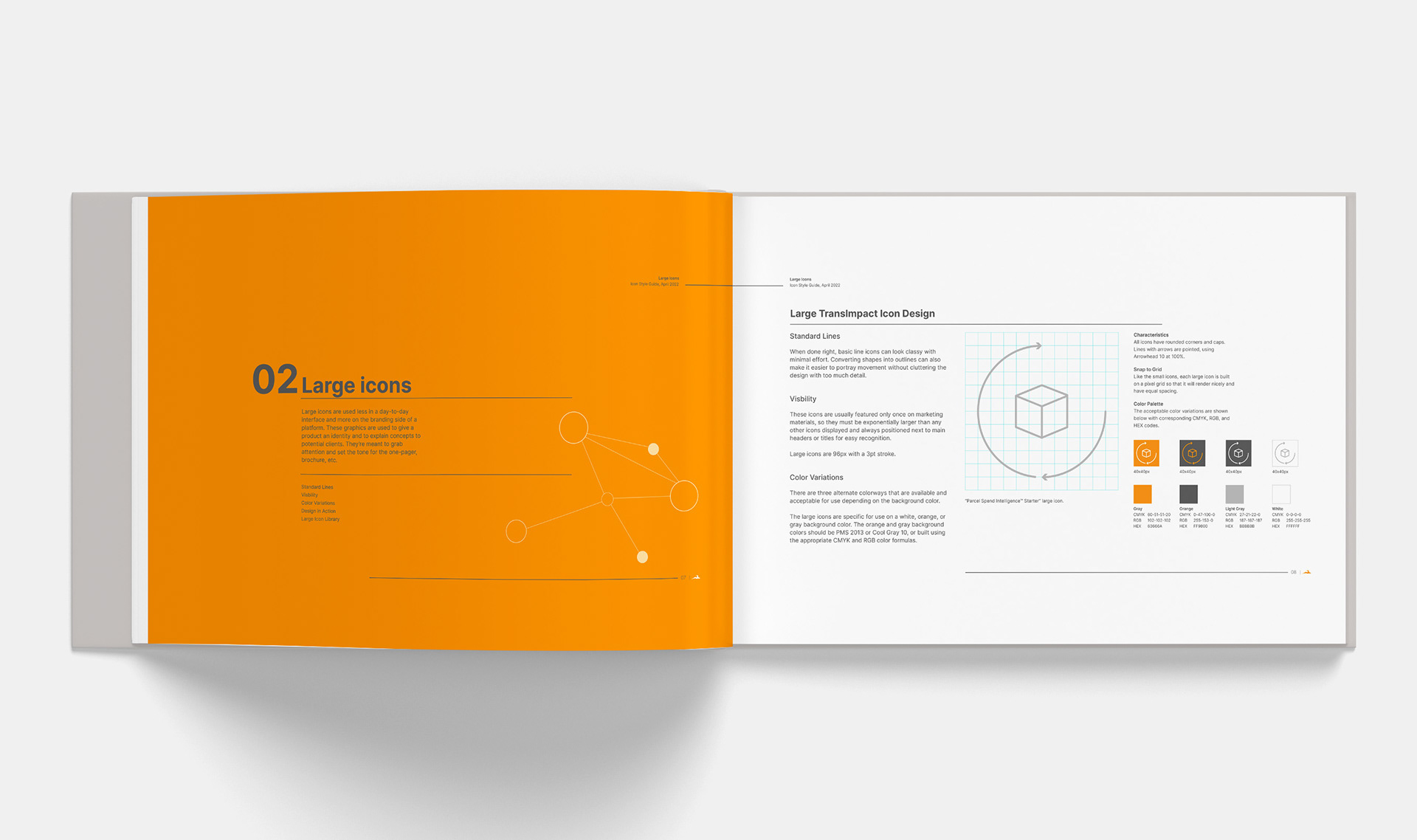
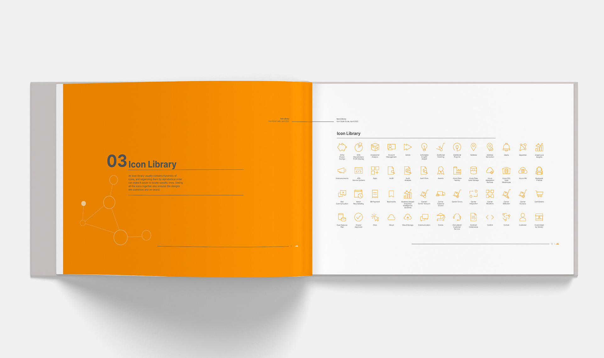

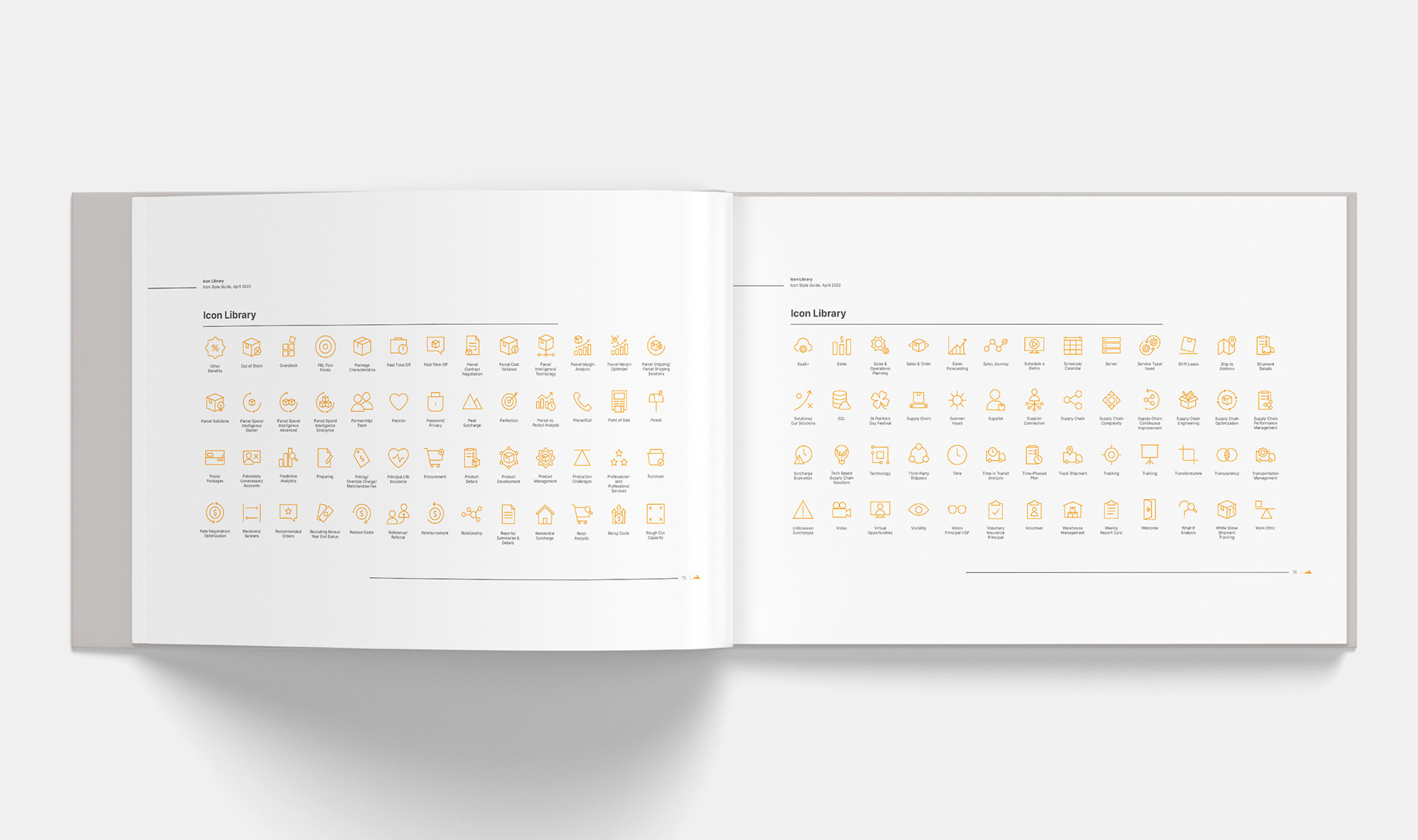
Icon Design Style Guide with over 200 icons for print and web.
____________
Client collateral.
I designed targeted sales presentations that highlighted cost-saving areas for our clients, demonstrating our value through clear and engaging visuals. One-pagers, brochures, and business cards are examples of print materials that utilized the icons I created in line and solid form.
Sample of client business review presentation I designed using brand guidelines.
__________
UI / UX demo.
I also created a sleek demo of the parcel tech portal with my own redesign to enhance user experience and correlate better with TransImpact's new branding. Given the sensitive nature of this information, I prioritized precision and security in every design detail, ensuring that all materials conveyed reliability and trustworthiness while upholding our standards for confidentiality and accuracy.
Demo of the PSI dashboard I designed with sample data.
__________
Project details.
Company
TransImpact
Role
Creative Content Specialist
Year
2021-23
Services
Branding
UI / UX design
Digital & print marketing collateral
Social campaigns
